![]()
![]()
The goal of CGGP is to provide a sequential design of experiment algorithm that can efficiently use many points and interpolate exactly.
You can install CGGP from GitHub with:
# install.packages("devtools")
devtools::install_github("CollinErickson/CGGP")To create a CGGP object:
## basic example code
library(CGGP)
d <- 4
CG <- CGGPcreate(d=d,200)
print(CG)
#> CGGP object
#>    d = 4
#>    output dimensions = 1
#>    CorrFunc = PowerExponential
#>    number of design points             = 193
#>    number of unevaluated design points = 193
#>    Available functions:
#>      - CGGPfit(CGGP, Y) to update parameters with new data
#>      - CGGPpred(CGGP, xp) to predict at new points
#>      - CGGPappend(CGGP, batchsize) to add new design points
#>      - CGGPplot<name>(CGGP) to visualize CGGP model
A new CGGP object has design points that should be
evaluated next, either from CG$design or
CG$design_unevaluated.
f <- function(x) {x[1]^2*cos(x[3]) + 4*(0.5-x[2])^3*(1-x[1]/3) + x[1]*sin(2*2*pi*x[3]^2)}
Y <- apply(CG$design, 1, f)
Once you have evaluated the design points, you can fit the object
with CGGPfit.
CG <- CGGPfit(CG, Y)
CG
#> CGGP object
#>    d = 4
#>    output dimensions = 1
#>    CorrFunc = PowerExponential
#>    number of design points             = 193
#>    number of unevaluated design points = 0
#>    Available functions:
#>      - CGGPfit(CGGP, Y) to update parameters with new data
#>      - CGGPpred(CGGP, xp) to predict at new points
#>      - CGGPappend(CGGP, batchsize) to add new design points
#>      - CGGPplot<name>(CGGP) to visualize CGGP model
If you want to use the model to make predictions at new input points,
you can use CGGPpred.
xp <- matrix(runif(10*CG$d), ncol=CG$d)
CGGPpred(CG, xp)
#> $mean
#>              [,1]
#>  [1,] -0.52367139
#>  [2,] -0.31521070
#>  [3,]  0.05781108
#>  [4,]  0.94199482
#>  [5,]  0.98578179
#>  [6,] -0.22661334
#>  [7,]  0.17936738
#>  [8,] -0.16986576
#>  [9,]  0.73173845
#> [10,] -0.15488181
#>
#> $var
#>               [,1]
#>  [1,] 0.0092572099
#>  [2,] 0.0221140651
#>  [3,] 0.0094446082
#>  [4,] 0.0134280357
#>  [5,] 0.0012771995
#>  [6,] 0.0002103327
#>  [7,] 0.0035323769
#>  [8,] 0.0149844852
#>  [9,] 0.0170830979
#> [10,] 0.0183621344
To add new design points to the already existing design, use
CGGPappend. It will use the data already collected to find
the most useful set of points to evaluate next.
# To add 100 points
CG <- CGGPappend(CG, 100)
Now you will need to evaluate the points added to
CG$design, and refit the model.
ynew <- apply(CG$design_unevaluated, 1, f)
CG <- CGGPfit(CG, Ynew=ynew)There are a few functions that will help visualize the CGGP design.
CGGPplotblocksCGGPplotblocks shows the block structure when projected
down to all pairs of two dimensions. The plot is symmetric. The facet
labels be a little bit confusing. The first column has the label 1, and
it looks like it is saying that the x-axis for each plot in that column
is for X1, but it is actually the y-axis that is
X1 for each plot in that column.
CGGPplotblocks(CG)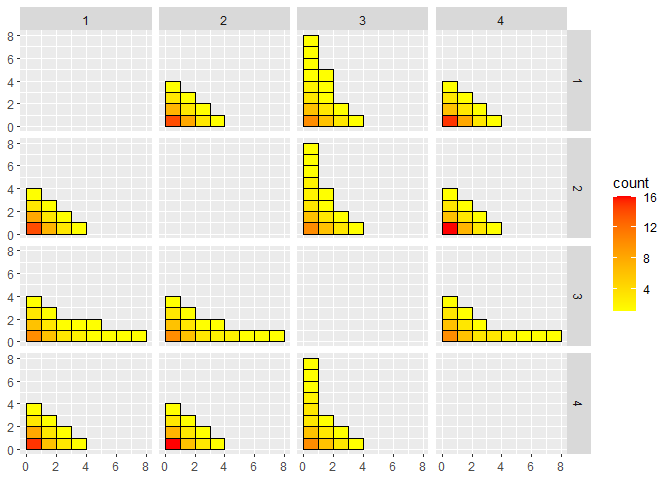
CGGPplotheatCGGPplotheat is similar to CGGPplotblocks
and can be easier to read since it is only a single plot. The \((i,j)\) entry shows the maximum value for
which a block was selected with \(X_i\)
and \(X_j\) at least that large. The
diagonal entries, \((i, i)\), show the
maximum depth for \(X_i\). A diagonal
entry must be at least as large as any entry in its column or row. This
plot is also symmetric.
CGGPplotheat(CG)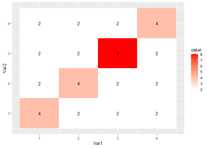
CGGPhistCGGPhist shows histograms of the block depth in each
direction. The dimensions that have more large values are dimensions
that have been explored more. These should be the more active
dimensions.
CGGPplothist(CG)
#> Warning: Transformation introduced infinite values in continuous y-axis
#> Warning: Removed 12 rows containing missing values (`geom_bar()`).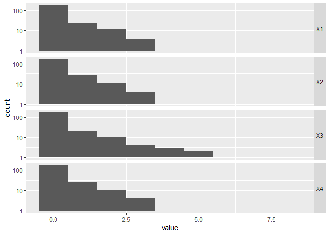
CGGPplotcorrCGGPplotcorr gives an idea of what the correlation
structure in each dimension is. The values plotted do not represent the
actual data given to CGGP. Each wiggly line represents a random Gaussian
process drawn using the correlation parameters for that dimension from
the given CGGP model. Dimensions that are more wiggly and have higher
variance are the more active dimensions. Dimensions with nearly flat
lines mean that the corresponding input dimension has a relatively small
effect on the output.
CGGPplotcorr(CG)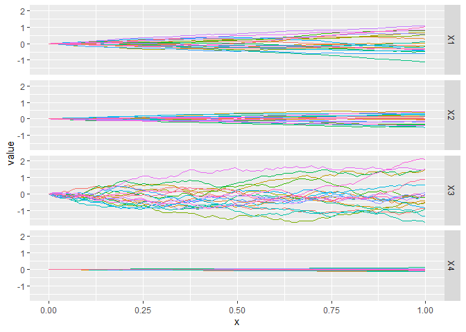
CGGPplotvariogramCGGPplotvariogram shows something similar to the
semi-variogram for the correlation parameters found for each dimension.
Really it is just showing how the correlation function decays for points
that are further away. It should always start at y=1 for
x=0 and decrease in y as x gets
larger
CGGPplotvariogram(CG)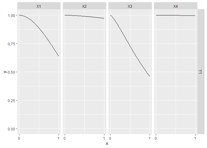
CGGPplotsliceCGGPplotslice shows what the predicted model along each
individual dimension when the other input dimensions are held constant,
i.e., a slice along a single dimension. By default the slice is done
holding all other inputs at 0.5, but this can be changed by changing the
argument proj. The black dots are the data points that are
in that slice If you change proj to have values not equal
to 0.5, you probably won’t see any black dots. The pink regions are the
95% prediction intervals.
This plot is the best for giving an idea of what the higher dimension function look like. You can see how the output changes as each input is varied.
CGGPplotslice(CG)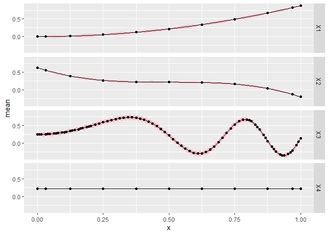
The next plot changes so that all the other dimensions are held constant at 0.15 for each slice plot. When moving from the center line, the error bounds generally should be larger since it is further from the data, but we should see similar patterns unless the function is highly nonlinear.
CGGPplotslice(CG, proj = rep(.15, CG$d))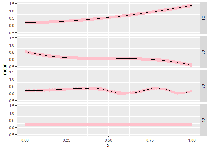
CGGPplotthetaCGGPplottheta is useful for getting an idea of how the
samples for the correlation parameters (theta) vary compared to the
maximum a posteriori (MAP). This may be helpful when using
UCB or TS in CGGPappend to get an
idea of how much uncertainty there is in the parameters. Note that there
are likely multiple parameters for each input dimension.
CGGPplottheta(CG)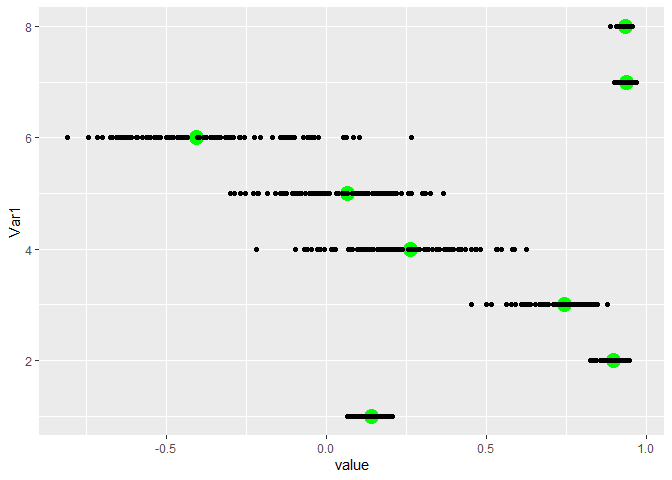
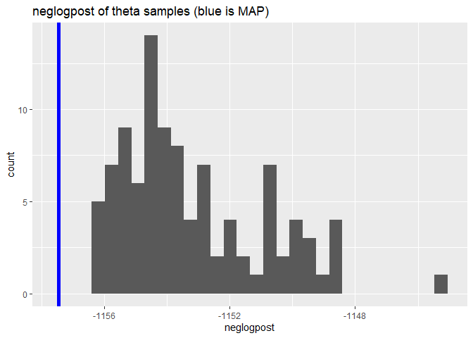
CGGPplotsamplesneglogpostCGGPplotsamplesneglogpost shows the negative log
posterior for each of the different samples for theta. The value for the
MAP is shown as a blue line. It should be at the far left edge if it is
the true MAP.
CGGPplotsamplesneglogpost(CG)